The mark,
and how to use it.
Three lockups, three colourways, vector and high-resolution files. If the format you need is not here, ask and we will prepare it.
Four letters, one form
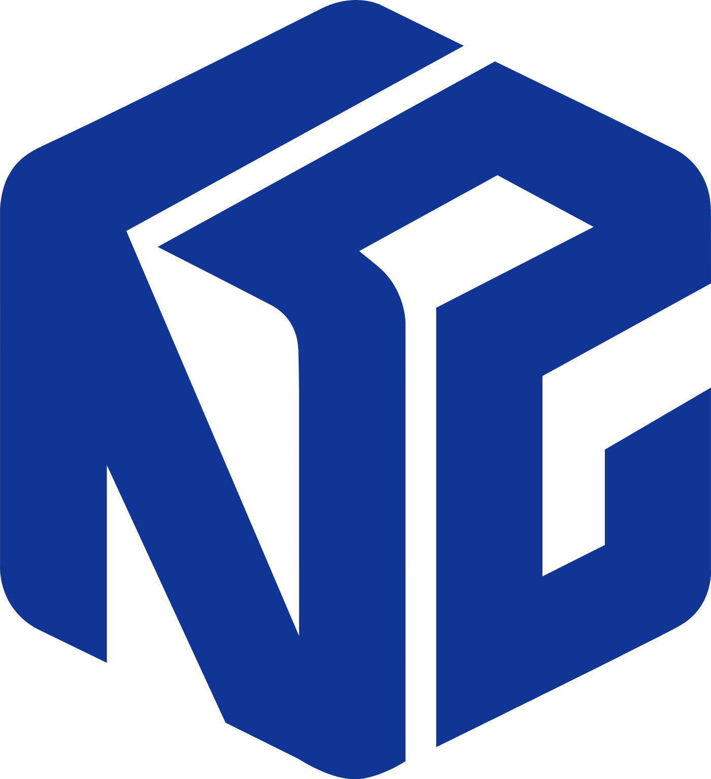
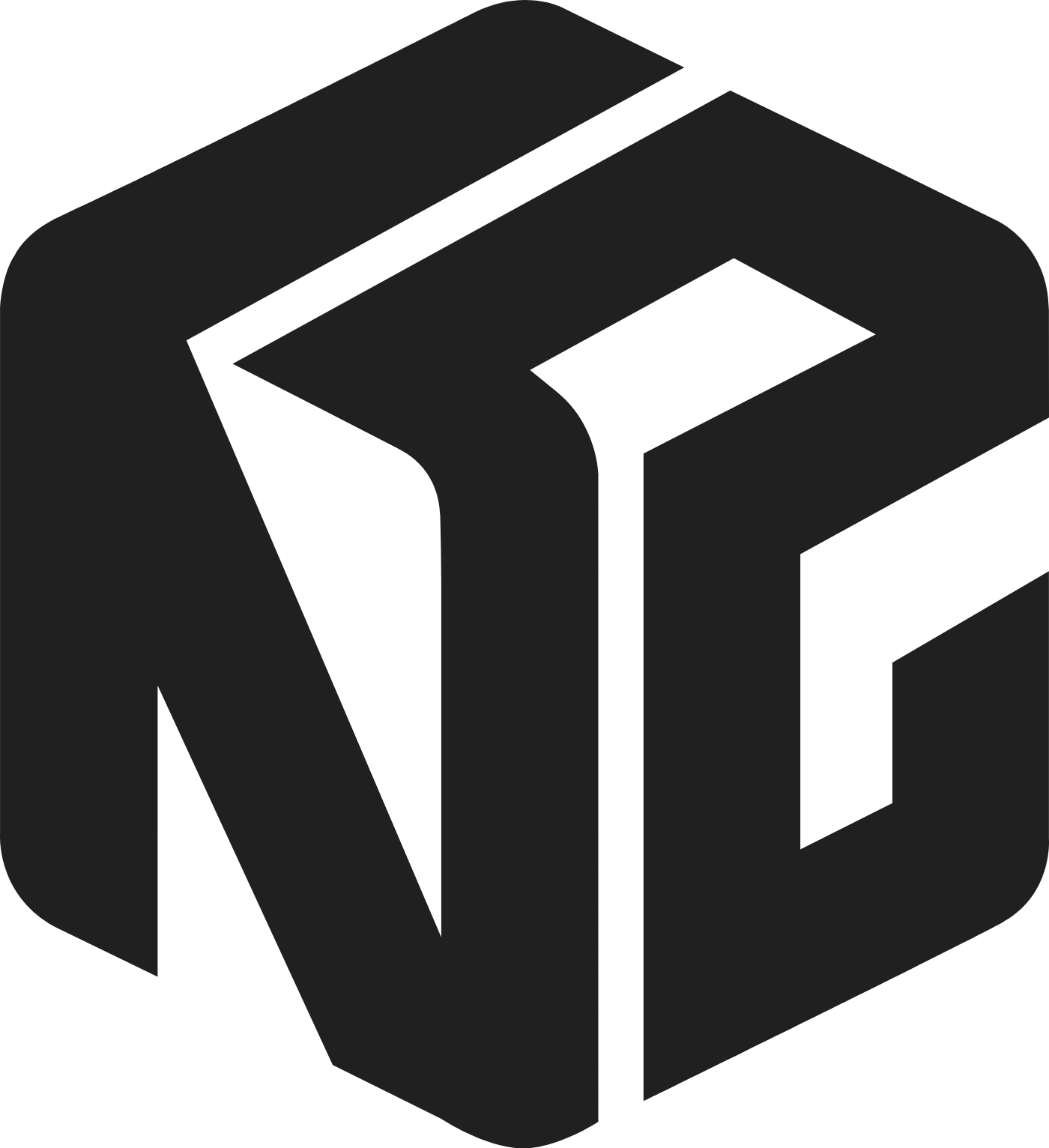
I, N, T and 2 are stylised until they stop behaving as letters and start behaving as parts. Nothing is added to them and nothing is decorative — the whole mark is those four characters and the joints between them.
Integration, literally
The parts interlock into one closed body: no piece reads on its own, and none can be removed without the whole collapsing. That is the company's name drawn rather than stated — separate components delivered as a single working system.
Read as a solid
Held in axonometric projection — the convention of engineering drawing — the assembly reads as a solid object rather than a flat badge. One deep blue, one flat ink, no gradient and no shading on the faces: legible at 24 px on an asset label and at two metres on a backdrop.
Pick the lockup by the shape of the space. Blue is the default; ink is for single-colour documents; white is for dark and photographic grounds.
The default — headers, documents, slide footers.
Narrow or square spaces — roll-ups, badges, stamps.
Where the name is already present — avatars, favicons, labels.
Vector for anything printed or scaled. PNG only where a vector cannot be placed.



Keep other elements out of the dotted zone. X is the height of the cube.
The name is INT squared — int × int, the two I's of Intelligent Integration. Never Int2, int2 or INT-2; the domain int2.vn stays lowercase.
Scale proportionally. Do not recolour the mark, shade its faces, rotate it, add shadows or outlines, re-typeset the wordmark, or set it inside a box of its own. On dark or busy grounds use the white file.
Ask us for the file you need.
A PDF or EPS for a print house, the mark cut for embroidery, an event backdrop — tell us the medium and we will prepare it.
[email protected]